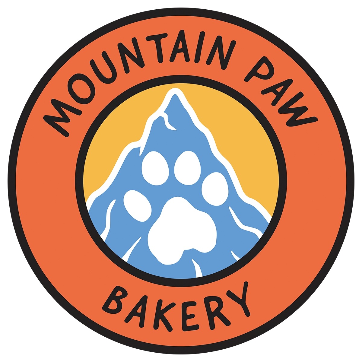
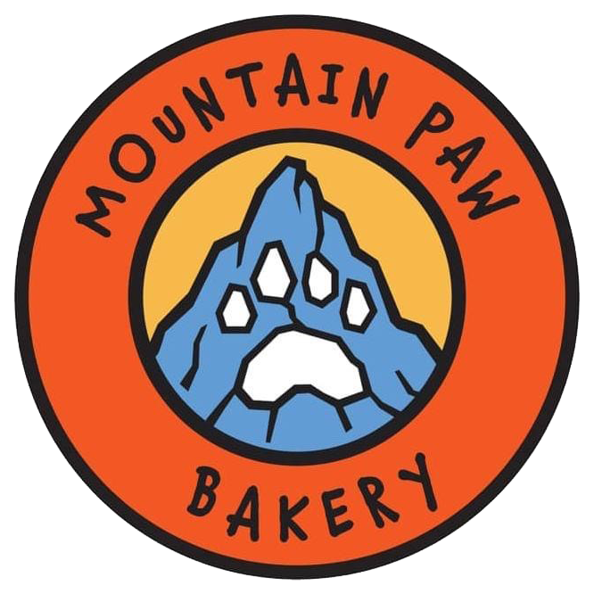
Mountain Paw Bakery requested some new labels for their dog treats, and being that they were expanding, I asked if they were interested in any rebranding of current items, like their logo. After a quick discussion, they decided a facelift on their current logo would be a great idea. After learning the sentimental value of the original logo, as well as why the company started (their dog Zoe), we decided to go in a similar direction, with a modern look…and using Zoe’s actual paw print.
I created a few options that ranged from very similar-to-the-old, but using Zoe’s paw print…to incorporating new mountains, colors and fonts. They went with a middle ground of the same layout, mountains and two of the original colors. They chose a fresher orange that has a softer, more friendly tone and went with a new font that still portrays the handwritten style of the old one. We also went with white outlines for the mountains to give it more of a snowy feel – appropriate for being from Steamboat Springs, CO which remains snowy all winter long.
Original Logo

